Case study
Rebuilding navigation around user goals instead of product silos
A powerful enterprise platform had grown increasingly complex, and users consistently described the navigation as confusing, overlapping, and difficult to learn.
I led a large-scale information architecture initiative to redesign the navigation around mental models, workflows, and task clarity rather than internal product structures.
Impact snapshot
Validated a navigation model built around user intent
Validated the new structure at scale
Led multi-phase statistically significant IA research through a survey, tree test, and qualitative walkthroughs.
Reframed the navigation model
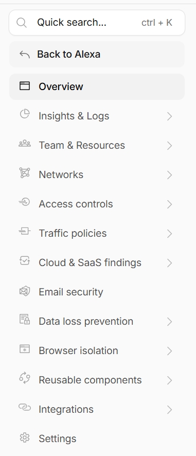
Moved the dashboard from product-centric organization to a use-case focused mental model.
Created scalable governance
Established principles for top-level additions, child pages, reusable systems, settings placement, and future feature expansion.
Made language more literal
Reduced reliance on acronyms, internal product names, abstract concepts, and labels that required company-specific context.
The problem
The navigation reflected the company's org chart, not how users thought about their work
As the enterprise platform expanded, the dashboard evolved organically around products, feature ownership, and technical terminology. Users repeatedly described the experience as fragmented, overlapping, difficult to scan, and difficult to learn. Or as one so aptly put it:
"The burden of navigation."
Another user said they would "end up with a dozen tabs open," sometimes with duplicates they did not realize were there.
The deeper issue was not just naming. Research showed that users approached the dashboard based on their goals like connecting their network, securing applications, investigating traffic, managing devices, and configuring policies. They weren't thinking about products at all.
The project quickly evolved from a navigation cleanup effort into a broader rethink of how the platform should organize itself around user intent.
The solution
A layered information architecture model
My solution revolved around a five-layer IA framework that grouped the dashboard by how users engage with the platform.
Layer 1
Observability
What should I know about my environment?
Layer 2
Object ecosystem
What am I protecting and connecting?
Layer 3
Use-case management
How do I configure security workflows?
Layer 4
Global configurations
What reusable systems support multiple workflows?
Layer 5
Global settings
How do I manage the overall platform experience?
Guidance for sustainable navigation growth
Top-level items
These were exceptionally rare. The new IA was intended to be collectively exhaustive and scalable enough for future features. A new top-level item could be added if it:
- Introduced a net new use case
- Established a brand new way of interacting with the enterprise dashboard
I treated these as new pillars in the user experience, or as things the enterprise platform provides a service for managing. They were areas that could potentially be the main or only thing someone uses in the dashboard.
Child-level items
A page could become a child item if it met both criteria:
- It allowed for immediate action or value: new child items needed object creation directly from the empty state or another immediate value pathway.
- It was mutually exclusive from other nav items: closely related or overlapping content was better suited as a tab or inline view.
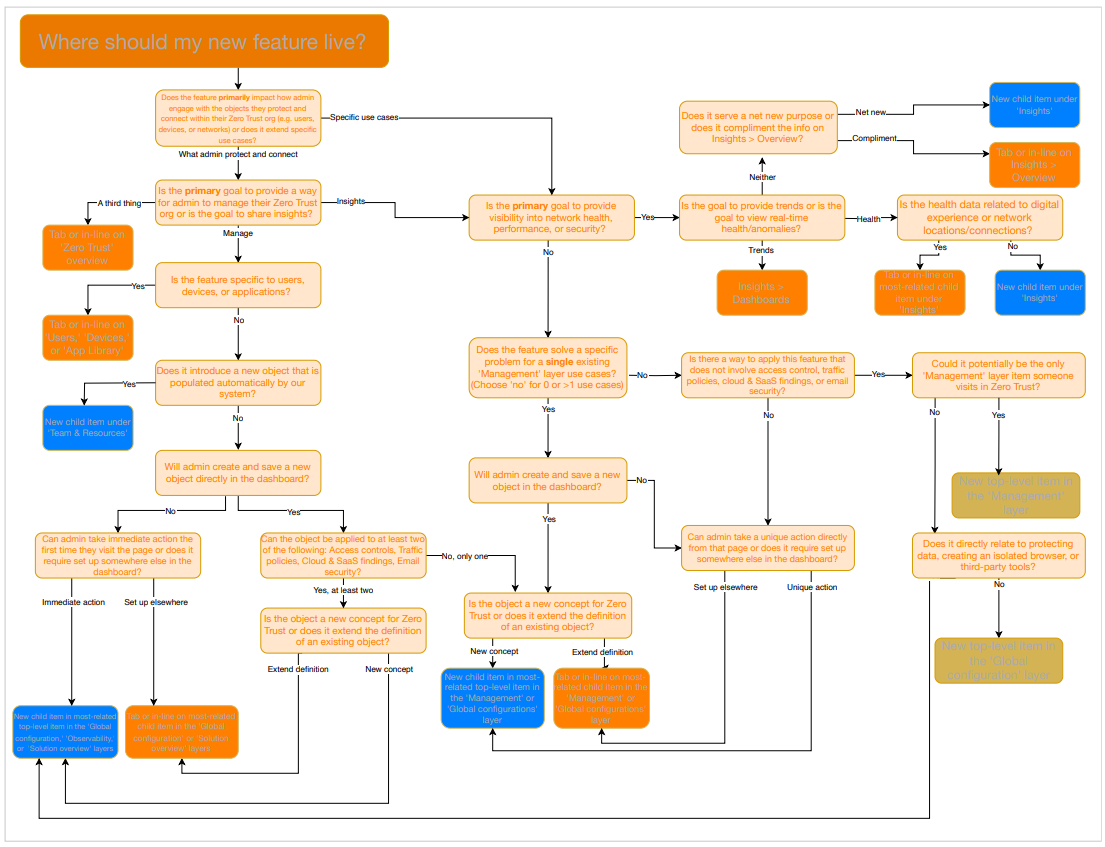
Operationalized decision path
I turned the placement criteria into a decision flowchart that helped teams reason through the tradeoffs before adding new navigation surface area. The flowchart asked whether a feature introduced a new use case, served an existing workflow, created immediate action or value, overlapped with another page, or belonged better as a tab or inline view.
To make that guidance usable beyond a static artifact, I translated the flowchart into an AI-driven skill. Product and design partners could describe a proposed feature, and the skill would return a recommendation for where it should live, such as a new child item, a tab, an inline view, or an existing section, along with the reasoning behind that recommendation.
Research approach
Multi-phase research and testing
To validate the approach, I led a multi-phase research study. It combined qualitative interviews, moderated walkthroughs, large-scale surveys, tree testing, and open-ended mental model analysis. It was intentionally iterative: I would test a structure quickly, study where users struggled, adjust the model, and test again.
The validation data was statistically significant, which gave the team more confidence that we were not just reacting to a handful of loud anecdotes. I used the research to evaluate findability, overlap, terminology clarity, user mental models, and conceptual understanding of reusable systems.
I brought those findings to product and engineering leaders to build the buy-in needed across 30+ stakeholders. That alignment helped move the work from a proposed IA cleanup to a shared direction for navigation strategy, governance, and future expansion.
Reflection
Navigation shapes how users understand complex systems
Here are principles I would carry into any complex product environment:
01
Labels should be literal, specific, and jargon-free
Navigation labels should clearly communicate what users will find or do. We need to avoid clever phrasing that may obscure meaning, and we also need to be careful with terms we assume are industry standard. Top-level items should feel mutually exclusive and collectively exhaustive. Specificity not only helps users scan, it is critical in building trust.
02
Users think about their tasks, not how our system works
Users approach the dashboard with goals, not technical models in mind. They look at navigation labels almost like a task list. When labeling navigation items, we need to prioritize task clarity over system accuracy. Imagine explaining the navigation structure to a user by saying, "Here, you will find X." Whatever X is should be the label. This means avoiding product names and acronyms when possible.
03
Navigation goes beyond the menu
Navigation happens everywhere. The side navigation menu cannot and should not be the only way users understand the system and make connections. Users have a deep desire for search, personalization like recents or favorites, clear in-workflow connections, and strong product content to reduce reliance on the side navigation alone.